Date picker
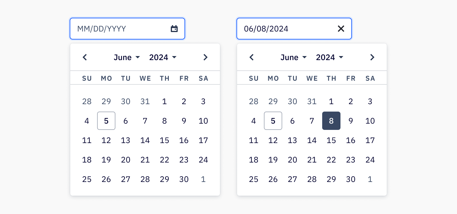
The date picker allows users to enter a date or date range either through text input or choosing a date from a calendar.
Loading...
Overview

Resources
Variations
Date pickers let users select a date or range of dates from a calendar. A date picker is great for allowing the user to enter a date by merely clicking on a date in the pop-up calendar, instead of having to remember a specific date off-hand.
The calendar also provides validation of dates by visually restricting date ranges, and ensures that the input is filled in with the proper format. The date picker component can be used with Camp’s input component to allow the user to type a date in, or open the calendar for date selection.
Date with input

Date range

Accessibility
Keyboard support
- If using date picker with Camp’s input component,
tabto focus on the input, andtabagain to focus on the calendar trigger - Use
enterorspaceto open the calendar tabto focus on the previous or next months andenterorspaceto selecttabcan also be used to focus on current day, or if a date is already selected, will focus on the currently selected date- Using the arrow keys will navigate through the dates in the calendar, and
enterorspaceis used to select a new date which closes the date picker
Last updated on