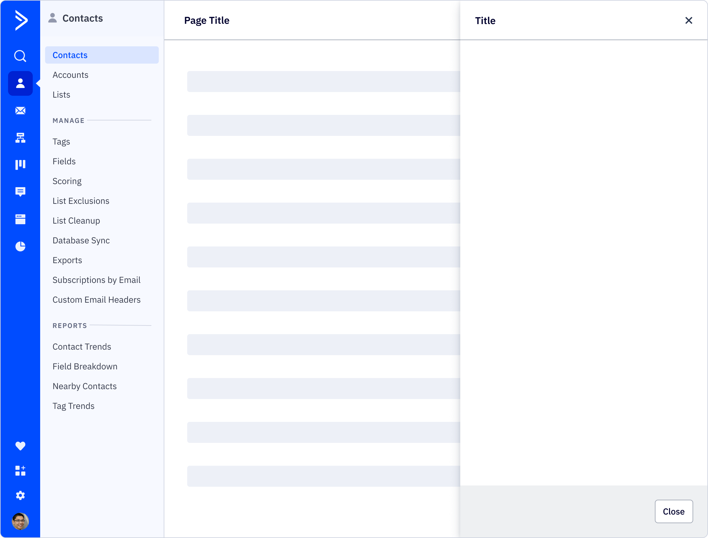
Drawer
Drawers are used to display context-sensitive actions and inform or shift focus without losing the user’s current state.
Loading...
Resources
Variations
Narrow drawer

Wide drawer

Usage
Best practices
- The drawer is a supplementary container for contextual actions and information, such as clicking on a table row and seeing additional data fly out in a drawer. Unlike a modal, the drawer is a more passive way of displaying information that doesn’t disrupt the user’s workflow or fully block the rest of the information on the page.
- For use cases like confirmations, condtioncal changes, and important warnings, a modal should be used instead.
- The drawer can be considered an extension of the current page, and it can do all of the same things such as trigger a modal and navigate the user to a different page. The drawer can also open a different view of the drawer, although this interaction should be used minimally to not guide the user too far off their original task. If the user has a drawer open and triggers another drawer, it will replace the current drawer. If the user opens the help drawer on the left, it will close any open drawer on the right.
- When closing a drawer with unsaved work, a confirmation modal should be used for any work that is at risk for being lost due to the drawer closing (whether automatically or from the user manually closing it).
- The narrow drawer should be used for displaying non-actionable information or any actions that are comprised of mostly basic form fields. The wide drawer should be reserved for heavier interactions where the user could benefit from a little more room to work than what the narrow drawer provides, such as being able to read and use actions displayed in cards.
- A user can continue to interact with the UI underneath the drawer. This allows the user to navigate elsewhere or interact with other elements that may open the drawer. For instances where a user should be able to see all of the content to the left of a drawer, use a side panel page layout instead.
Content guidelines
Drawer headers should be clearly and consisely written, in sentence case and with no punctuation at the end. Avoid unneccessary or ambiguous words, but include articles like “a” and “the,” as they provide clarity especially in translating.
✅ DO
-
Add a new account
-
Create a new form
-
Connect your Calendly contacts
🚫 DON’T
-
Add Account
-
Create New Form
-
Connect Calendly
Accessibility
Keyboard support
- From the trigger that launches the drawer, use
spaceorenterto open the drawer tabwill first focus on the drawer dismiss (close) in the header before following the tab order in the drawer body, followed by the drawer footer actionsspaceorentercan also be used to select an option from the drawer footer
Similar components
Last updated on