Input
Inputs are used to allow users to provide information in the form of text input.
Loading...
Overview

Resources
Variations
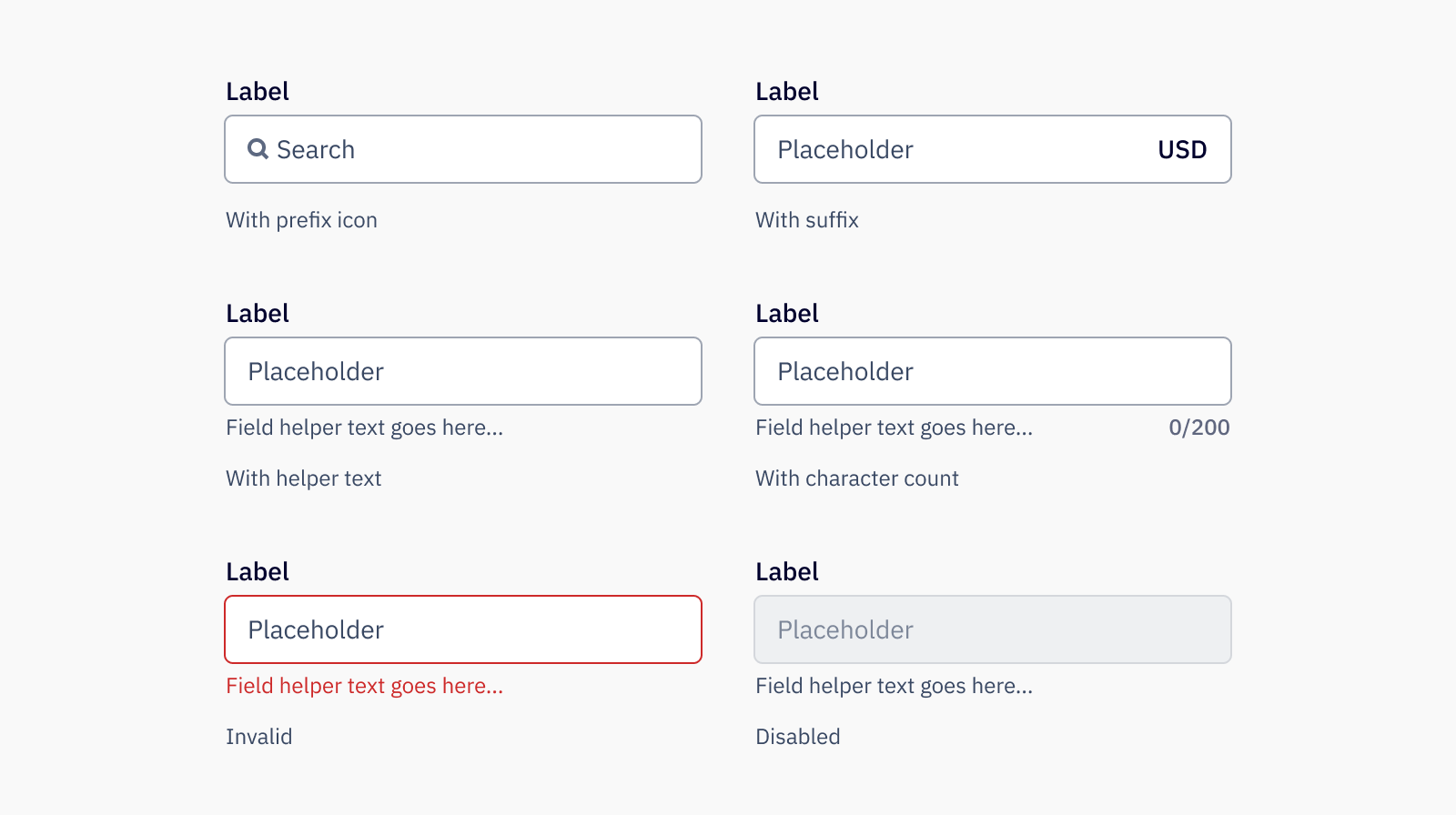
The default input consists of a value, and sometimes a prefix and/or suffix. When no input label is used, the input should always have a placeholder to help describe it.

Type The input type can be specified on the base input element for usage with numbers, emails,
passwords, etc.

Prefix Use prefix to add a stylized text prefix into the input.
Prefix icon
Commonly used to indicate a search field, prefix icon shows a specified icon at the start of the input element. Note that only icons available at size medium are compatible.
Suffix
Use suffix to add a stylized suffix to the input.
Character count
Add a character count to limit the number of characters that can be entered into the input.
Invalid
Use invalid to signal to users when the input is not in a valid state, such as when an email or phone number is malformed, or a required field is not completed.
Disabled
Use disabled when the input can not be interacted with, such as a locked field. Use this state as sparingly as possible, as it does not appear in kayboard navigation and may be challenging to be read by a screenreader.
Usage
Sizes
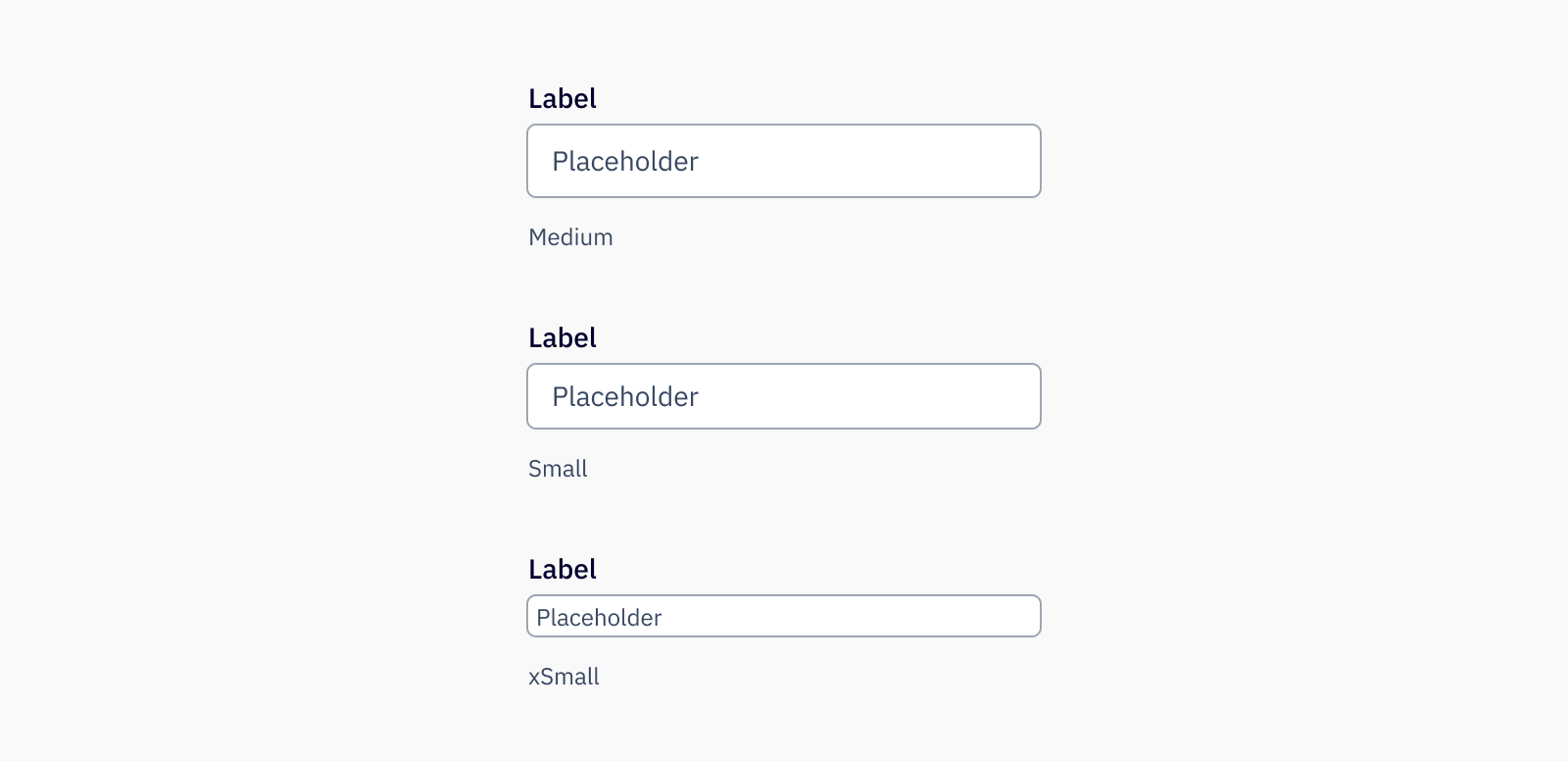
Inputs come in three sizes, the default medium size, a small size, and an xsmall size. Which size of the input to use is based mostly on the context of where it is placed.
- Medium inputs are used in most cases and should be used for all forms
- Small inputs are used when space is limited, such as within a builder (Campaigns, Landing Pages, etc.) sidebar
- xSmall inputs are used exclusively when space is extremely limited, such as within a color picker

Best practices
- Ensure that the text field has a visible label that is short and easy to read, as this provides context to the user in filling out the input. Lack of a label creates accessibility issues, especailly to those using assistive technology.
- Text inputs should be used when only when the expected input is short. For inputs where long inputs are expected, use a textarea.
Content guidelines
Input labels and placeholders should be clearly and consisely written (no more than 3 words), in sentence case and with no punctuation at the end. Helper text should also be in sentence case with no punctuation at the end. Avoid unneccessary or ambiguous words, but include articles like “a” and “the,” as they provide clarity especially in translating. Use inclusive language that doesn’t discriminate from those who use assistive technology.
✅ DO
-
First name
-
Last name
-
Phone number
🚫 DON’T
-
First Name
-
Last name:
-
What is your phone number?
Placeholders should not repeat what the label states but instead prompt the user with what to do, whether by displaying an example of an acceptable input (such as a sample phone number in a phone input) or providing instruction (“search” in a type to filter input). All inputs should have a placeholder. Keep in mind that important information should never be placed in placeholders, as it disappears when the user starts typing. For anything that helps the user understand how to complete the input field, use helper text.
Accessibility
Keyboard support
- Move focus to an input using the
tabkey - Use any key to type in the input, and left and right arrow to navigate between characters
- If using an actionable suffix,
tabto focus on the suffix action andspaceorenterto interact with the suffix