Modal
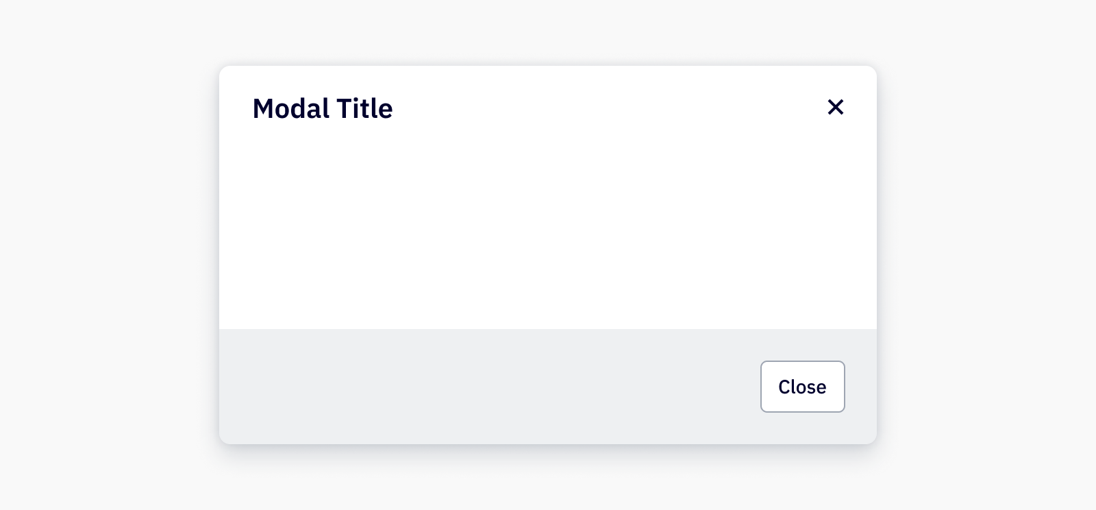
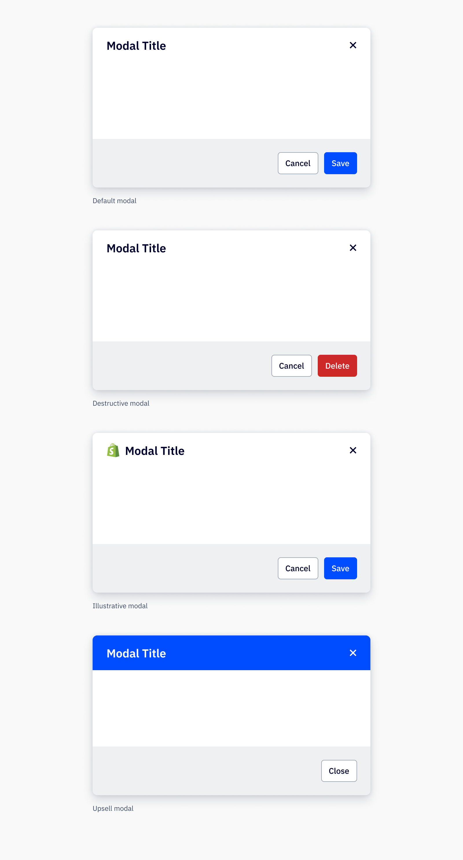
Modals are commonly used to grab the user’s attention to inform or shift focus to a particular task or action, often interrupting or locking the UI until the user takes action.
Loading...
Overview

Resources
Variations

Usage
Best practices
- Modals are disruptive to a user’s workflow and should be used sparingly, as they temporarily block all other interaction and the rest of the application. Use modals for confirmations, conditional changes, and important warnings that can prevent critical errors.
- Modals are also ideal to gather input necessary for continuing a short and focused task, such as renaming a Campaign.
- Use cases outside of these mentioned may be better suited for a drawer or Fullscreen Takeover.
- A modal should not open another modal on top of it. Consider using steps within the modal to section a larger modal into smaller parts.
- A modal should not be used when it requires additional information for decision making that is unavailable in the modal itself.
Content guidelines
Modal headers should be clearly and consisely written, in sentence case and with no punctuation at the end. Avoid unneccessary or ambiguous words, but include articles like “a” and “the,” as they provide clarity especially in translating.
✅ DO
-
Add a new account
-
Create a new form
-
Connect your Calendly contacts
🚫 DON’T
-
Add Account
-
Create New Form
-
Connect Calendly
Accessibility
Keyboard support
- From the trigger that launches the modal, use
spaceorenterto open the modal tabwill first focus on the modal dismiss (close) in the modal header before following the tab order in the modal body, followed by the modal footer actionsspaceorentercan also be used to select an option from the modal footer
Similar components
Last updated on