Borders
Borders help to visually differentiate elements and add depth to the design. Set width, radius, style, and shadow to create consistent and effective borders.
Border width
The border width property sets the stroke weight of an element’s four borders.
border-0No border0px stroke weightborder-1Thin1px stroke weightborder-2Medium2px stroke weightBorder weight usage
Borders are helpful for establishing hierarchy and structuring content and in most cases are used for separating architectural elements such as the page header and navigation from the primary content of the page. Most of the time, defaulting to border-1 is sufficient in defining this separation. The heavier weight of border-2 is reserved for when the border plays an active role in the interaction of the design, such as showing the moving gradient of the AI border’s loading state.
Border radius
The border radius allows you to add rounded corners to elements.
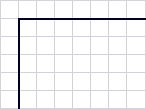
border-radius-0
No radius
0px corner radius
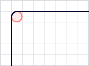
border-radius-1
2px radius
2px corner radius
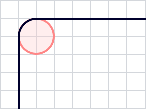
border-radius-2
4px radius
4px corner radius
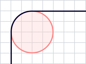
border-radius-3
8px radius
8px corner radius
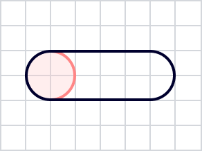
border-radius-rounded
Rounded
99rem corder radius
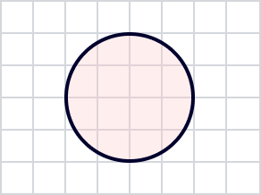
border-radius-circle
Circle
100% corder radius
Border styles
Border style sets a border to either dashed, or solid. Note that a border with a style of b-none removes the border entirely.
border-solid
No border
0px stroke weight
border-dashed
Dashed
dash: 4px, gap: 8px
border-dotted
Dotted
dash: 1px, gap: 2px
Border style usage
For the most part, a solid border should be used whenever using borders. Dashed and dotted border styles are reserved to visually indicate specific interactions to our users. Use border-dashed for the perimeter of a droparea, such as for file uploads or drag and drop. Use border-dotted as a trigger for a tooltip, often replacing the need for an informational icon in tight spaces.
