Elevation
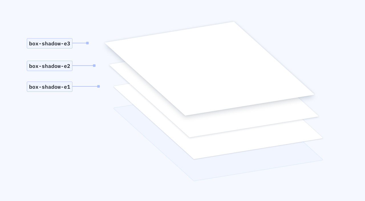
Elevation creates depth to the interface by applying drop shadows in a layered manner to lift elements from the background. Elevation can both be helpful in guiding focus as well as indicating interaction expectations of the UI.
Loading...
Levels of elevation
Elevation can be applied to different surfaces using elevation tokens. The higher in number the token, the more depth it will appear to have as depicted by the spread of the dropshadow. The lower in number the token, the closer it is to the page with a flatter appearance.

Elevation best practices
When choosing elevation, consider these best practices before adding them to your project:
Use elevation to hone in on focus
Objects that appear closer to the eye will be more in focus, and easier to capture the user’s attention. Take a thoughtful approach to elevation by using it to prioritize an action above others on the page.
Use elevation consistently by component
Many components that utilize elevation have an elevation token already assigned, and those that don’t likely stay flat on the page. If designing something new, consider related components and what level of elevation they sit at. For example, all cards should use the e-1 token.
Apply dropshadows with intention
Too many dropshadows can be disorienting and detract from the other intentional uses of it on the page. Dropshadows should not be applied for solely aesthetics.
Shadows
Using shadows
Install
yarn add @camp/tokensLarge shadows
Large shadows use the box-shadow-e3 token, and appear furthest from the page in terms of elevation. This dropshadow gives visual hierarchy to the element on the page and is reserved for large surfaces that provide important context to the user.
box-shadow-e3
Large
0px 8px 20px rgba(20, 35, 65, 0.16)
0px 0px 8px rgba(20, 35, 65, 0.12)
Components
- Drawer
- Modal
Medium shadows
Medium shadows use the box-shadow-e2 token, and appear as a midway point between the other levels of elevation. This dropshadow is for elements that sit over the rest of the ActiveCampaign UI, and commonly appear in the hover appearance of a component.
box-shadow-e2
Large
0px 2px 8 px rgba(20, 35, 65, 0.16)
0px 0px 2px rgba(20, 35, 65, 0.12)
Components
- Dropdown
- combobox
- Date picker
- Nested menu
- Toast
- Popover
- Tooltip
Small shadows
Medium shadows use the box-shadow-e2 token, and appear as a midway point between the other levels of elevation. This dropshadow is for elements that sit over the rest of the ActiveCampaign UI, and commonly appear in the hover appearance of a component.
box-shadow-e1
Small
0px 1px 4px rgba(20, 35, 65, 0.16)
0px 0px 2px rgba(20, 35, 65, 0.16)
Components
- Cards
Overflow
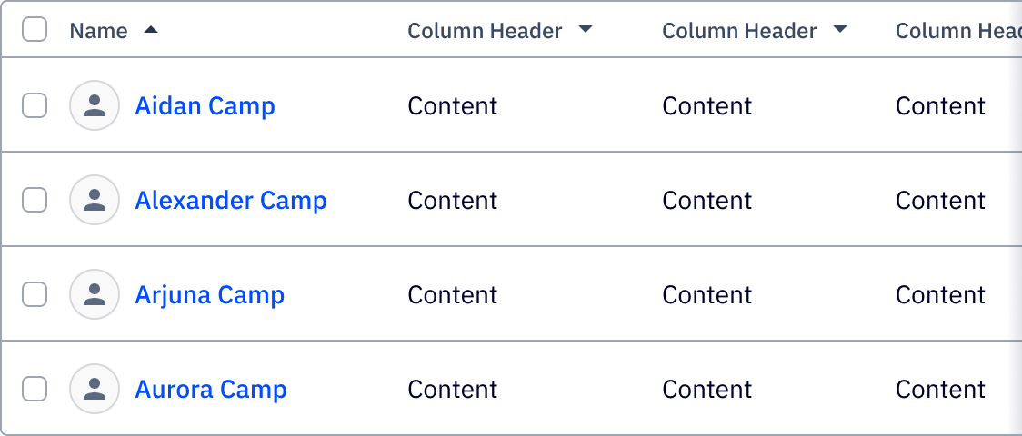
In situations where there is more within a container than what can be displayed, a shadow can sometimes help indicate to the user that scrolling is necessary. This is most commonly seen in tables or data visualization, where horizontal scrolling occurs in cases of overflow.

Overflow
width: space-2 (8px)
background: linear-gradient(90deg, rgba(20, 35, 65, 0.0) 0%, rgba(20, 35, 65, 0.12))
Dragging
The elevation of a surface should not be raised until interacted with. Hovering is not enough to raise a surface from box-shadow-e1 to box-shadow-e2, for example, but if the surface is clicked and dragged, then the elevation is temporarily lifted until set into it’s new position.

Borders and backgrounds
Borders
Dropshadows appear on elements with white and light-colored backgrounds, and when possible should not include the addition of a border. Borders add extra weight to the perimeter of the element, making the dropshadow look heavier and darker than it actually is.

Backgrounds
Dark backgrounds, such as the default simple tooltip and cards with dark or gradient backgrounds, should not use dropshadows to a lack of contrast between the background and the dropshadow color.

Photography
Brand photography should not use dropshadows when added to pages or cards. However, if elements are layered over the photograph, it is recommended that elevation tokens are applied. In some cases, the component’s original token may not be as prominent enough when placed over photography and need to be boosted to a higher token. With photography, using box-shadow-e2 and/or box-shadow-e3 tokens are recommended.
