Dropdown
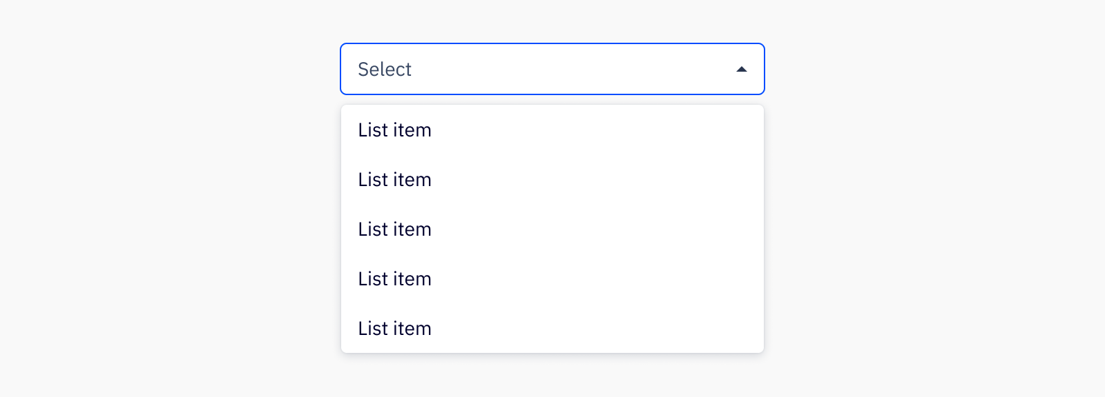
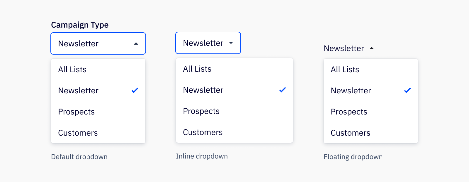
Dropdowns are used to select between choices. Dropdown list items can have a variety of content, including text, avatars, icons, and brand logomarks.
Loading...
Overview

Resources
Variations
Single select

Use the single select dropdown to allow users to pick a single option from a list.
Multiselect

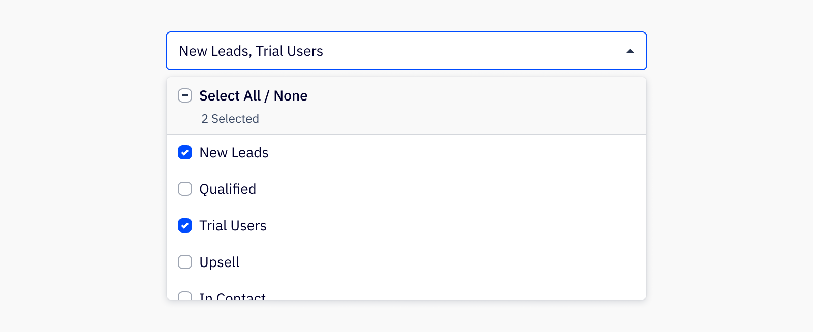
Use the multi select dropdown to allow users to pick and search from multiple options from a list.
Usage
Best practices
- Dropdown menus work best for small data sets where a user has anywhere from 5 to 15 items to choose from. For smaller datasets, checkboxes or radios should be used (depending on single or multiselect), and for datasets larger than 15, it is recommended to use a combobox instead.
- When grouped, liste items should be in some logical order that makes it easy for the user to read and understand, whether that is numerical or alphabetical or some other contextually-based grouping.
Accessibility
Keyboard support
Tabor (shift+tabto move backward) opens and closes the dropdown and moves focus. If the dropdown is closed the only item in tab index should beDropdownTrigger, thentabwill navigate to the next available tab indexed item in the page. If the dropdown is open, the tab order of the items within theDropdownMenuis as follows, if these items are included in the menu: search, select all/none, menu actions.- To open the dropdown on focus, press
spaceto open the menu. When the dropdown menu is open, use↑or↓to navigate list items andenterto select or deselect an item within the list. When selecting items, the menu closes after selecting in a single select dropdown but remains open in a multiselect dropdown. ↑or↓can also be used to open a closed dropdown menu.- If a multiselect dropdown has a search, upon open of the dropdown, the search input is in focus. Search can either be navigated away from using
tabor arrow keys. escwill close the dropdown when focused anywhere inside the component.
Similar components
Last updated on